
This message is for Joachim Müller-Lancé
at Kame Design:
My name is Val Castronovo and I'm a writer for
Secretariat News, the in-house magazine at the United Nations. I cover the
Arts for SecNews and am preparing a piece on the type design exhibit, which
features 4 of your winning entries.
I'd like to interview you about the exhibit and about
the secret world of type design.
I attended the opening and was enthralled by
your remarks.
Thank you so much! I was thrilled that Maxim asked me to speak, and glad for the chance to word feelings that I might have in common with all type designers. So, after thinking about all aspects I could, it came together so naturally.
How old are you, please?
41 years. I'm German, but lived outside of Germany since age 19: in Switzerland, the US, and Spain.
How long have you been practicing type design?
On the computer, for 10 years: since 1993. But drawing type was already part of my teenage endeavors in graphic design for my hometown... not unusual as I know from various designer friends. – At the School of Design in Basel/Switzerland, I loved the letterform classes, and am still preparing a few ideas from way back then.
How do you want to be identified in the story? A type designer, or a type and graphics designer?
Type and graphic designer. 'Graphic' without 's' please: it refers to the concept of the graphic arts. ("Graphics" are more like little pie charts, which people get from the "graphics guy" in the office...). Thank you!
What is your position at Kame Design (what does "principal" of Kame Design actually mean?), and how should I describe/identify Kame Design?
"Kame" means 'turtle' in Japanese. It is a well-loved animal in Asia, and carries great meaning in mythology. In professional practice, I chose Kame Design to be mainly myself, with occasional collaborators. I work from a generalist's perspective, but strong on drawing and creation from scratch, rather than re-composing as various other designers do. I offer cultural design, information design, corporate identity, custom type, some illustration and cartooning, and a little photography.
For me, there is no real difference between these disciplines: they feel like facets, aspects or angles to the same concept: finding and creating new shapes that convey MEANING in ways that come from exploring the needs of my task. Shapes more than images: distilling essence. Iconic, pictographic, symbolic. I find design theory too fancy, but when it visits my mind as I distill, it is welcome. I'm not a theorist, but a "maker". I find my thoughts and theory as I make things. Afterwards, I enjoy writing or lecturing about new thoughts I found on the way, and show my process.
Then, there is Typebox, which I founded together with my friend Mike Kohnke. This is where we sell our own fonts since 2000, along with those from a few great designer colleagues. Here too, we publish essays and other writings on our typographic work, serious or entertaining. We've been written up many times in design media – so we seem inspiring...?
What do you love about fonts?
Almost everything! So, what I "hate" most: Type has no color. I love color so much, and it has meaning too. Other people get the fun of putting color into our work. So, I can only ask them to do it really well –
How did you get involved in the secret world of fonts?
It was my dream for years, to create letters and see others use them. Discovering the first vector softwares, I knew they were meant for me. But it took a long time until I found them reliable for type as I desired to do it. Yet, testing a new typeface on-screen may feel like watching one's first child trying to walk? I type any silly words, and my font tries to please me...
What made you choose this type (so to speak!) of artistic expression, given that, yes it's influential, but on the other hand most people don't even realize they're looking at different fonts?
From infanthood on, I've been intrigued by letters (those squiggles looked so purposeful, they had to mean something?). From kids' comics to music band logos to design annuals, I wanted to be there too. A striking poster or calligraphy, conveying its power simply through its letters, seemed so smart to me. So it was no wonder that Japanese design, with its focus on lettering, kept triggering my interest across time (aside from popular animations on TV). Hence, "from the sublime to the ridiculous": many aspects of writing culture made their mark on me, not judging but playfully finding what might match and trigger me. Bringing a typeface from its first funny idea into a reasonably useable font is hard enough!
Why do fonts have such personality and impact? As in, what is the relationship between the font and the impact?
Type design is like offering the sound of a human voice to a written message. The basic shapes of the world's alphabets – or 'scripts' – lend themselves to interpretation, be it playful or pragmatic, emotional or informative. It may be a technical manual, a letter, a poem, or song lyrics? And then choosing a speaker, reader or singer, who will read your information or sing your song, to your audience or customers. That is the typeface. We type designers are the karaoke singers of your party. It's your choice – please choose the most inspired and professional.
How do you design a font? And for that matter, how do you know the design hasn't been done?
Some ideas may be planned by researching the needs of the market, but usually, my most intriguing experiences start with rather unusual ideas, like finding an odd shape and fighting to apply it to the entire alphabet, finding formal rules as I proceed. This might make my work more conceptual than lucrative, though I keep both marketable and avant-garde ideas on my desk all the time. As for ideas that may have been done before, I found a few instances long ago, when I was more shy and tried to guess the market, which may cause similarities? Today, this seems a good reason to me for going more personal than trendy. So if an idea of mine innocently turns out similar to somebody else's, why not contact that designer to see if something could be done about it together –
How many typefaces have you personally designed in your career?
3 typefaces available at Adobe Systems Inc., 1 typeface family at FontShop International, 2 typeface pairs at Typebox LLC. Several other typefaces received prizes from the Morisawa Awards and "bukva:raz", but are not entirely completed yet for sale to the public. Fonts are always large work, they contain many letters that most users don't know, but required for special usage. Especially my Japanese-Kanji designs might require a team to complete the usual 2000 to 4000 letters. Like most other type designers, I have a slew of ideas and designs waiting for completion and sale.
How many typefaces are there altogether today (you gave the figure in your speech and compared it to a figure in the 1970s)?
It is really hard to say: In 1974 there was a figure like 3000-plus, of registered "names". As for today, I was cautious: 30,000 registered names seemed safe; 50,000 may be real. As for inofficial versions floating around, there seems no way to determine.
Are there really that many different ways to construct letters (although obviously there are)?
YES. This is my shortest answer, because it is the greatest aspect. Just like music, fine arts, writing, film, sports, cuisine, any aspects of culture, we can keep going. It cannot be predicted or analyzed. I love that. It is human in its best way.
Briefly talk to me about the 4 (that right?) typefaces you designed that are on exhibit at the UN. Which is your favorite, and why? What inspired you to design this particular typeface?
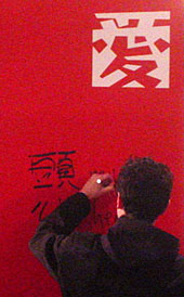
(Yes you are right, I'm happy about 4 typefaces being in this selection. I cannot really pick one of my 'kids' to be my favorite. Each one grew in its own way and deserved different care. But in the spirit of "bukva:raz", "Shirokuro" is the one that strikes the cultural bridge, with a Kanji and a Latin version matching – so it was shown on the Kanji panel that I signed.)
Type is always 'black-and-white', or "Shirokuro" in Japanese. Most graphic design is black-and-white too. But many designers only see the black 'positive' elements. I came to consider the 'negative' aspects as well, creating white "countershapes" inside or inbetween. Shirokuro makes positive and negative shapes grasp into each other; they cannot stand alone. I created both Kanji and Latin for the Morisawa Awards of 1999, since they always were the bridge between Eastern and Western type. They gave me 2 prizes for it. (And this year I received another award for a new Kanji – I'm very happy).
The essence of type design is not really about letters, but the spaces inside and between them, for good rhythm in text. I also play drums, and timing the *pauses* between beats seems more essential for creating mood and tension, than the actual beats. – Creatives think in reversals, and being left-handed also helps seeing things differently, after long years of feeling misfit.
Can the words font and typeface be used interchangeably?
Many people do, but we should not. The difference is conceptual:
"Typeface" is more general, it is the 'design' per se, the idea that the designer conceived in a set of shapes: Stylizing a script or writing system (e.g. Latin, Hebrew, Arabic) in a consistent manner, so that all its elements convey the same "feel" (dynamic, calm, cute, sober...), the same weight or detailing, simplicity or decorativeness, and can be recognized equally well (...or 'challenging'). (In musical terms, it would be a composition: a symphony or a song by a composer or a band.)
A "font" is the technical 'medium' on which the shapes of the typeface are recorded, to use them as needed for setting text. Since Gutenberg's times, it would be cases orderly filled with 1 style and size each of cast-metal letters (hence 'font' from French 'cast'). Since the mid-20th century it would be film negatives exposed on photographic paper (photo-typesetting), and nowadays a font is a piece of software that contains one of these sets of letters. (In music, that might be a tape, LP or CD with the artist's composition faithfully recorded.)
To use a typeface, you need to insert or install its font into a "typesetting device": First it was a printing press, then a phototypesetting machine, now it's the computer. (This would be like playing a CD on your stereo system.)
Some of the typefaces on display at the UN were like hieroglyphics and not like lettering at all: what's their purpose if they can't form words? Are they really typefaces?
You are right: Conceptually they are not typefaces, because they do not represent readable sounds, nor do they form words. But technically, they are 'fonts' alright, because ornaments etc. were created for use on typesetting equipment since Gutenberg already – and nowadays they are the same kind of 'font software' as typefaces are: just with images instead of letters. So if you type an A, you might get an airplane, a B may give you a little bus icon, and so on... Today they are called Pi-fonts (= picture/pictographic fonts), or popularly "dingbats".
Just like letters, they can be given any size or color, in the same way you'd use type on the computer. You don't need any image-editing software to use them, and don't need to juggle a host of image files. You can "write" these pictures in a plain text-editing program. This is very useful for managing large signage projects with pictograms, inserting technical symbols into documentations, or simply for decorating a newsletter with small illustrations or borders (like: type CCCCC for a row of christmas trees, select it and choose 'green' from the color picker...) – but each symbol can only be 1 color, just like type.
Well, then – a font with ancient Egyptian hieroglyphs would be a typeface if used for text samples in a museum, – but a Pi-font if used for party invitations to "Walk like an Egyptian" at the Pyramid Hotel in Las Vegas... and then there are fonts like my"Ouch!", where every letter is also an illustration...
My editor would like more in my story about the fonts themselves. How do they convey personality or mood? Specifically how—as in "sans serifs give a clean look, and the mood is elegance." Do you have any of that type, so to speak? In other words, can you speak more generally about fonts themselves, apart from your own creations?
Hmm... I cannot make any broad statements, or "easy rules". Those are a helpful first for acquiring typographic skills, and readily available in clip-art catalogs – but everyone needs to have his own desire to grow. Excitement is always the beginning, but ongoing curiosity also needs patience and persistence to survive. Personality or mood is what audiences may perceive first or only, but most of our work goes into the less perceivable aspects: consistency in all shapes, so that users have a safe instrument to play their music on. Of course they need to acquire a bit of own skill: Neither we type designers nor the computer can turn anyone into an artist.
There are time-worn notions about stylistic classifications
of type and their uses, like serif = traditional, sans = modern; matching
their history for no better wisdom. Yet, I have seen recent serifs that have
a more modern feel than early sans designs. And it is never the typeface alone,
but how it is arranged in a given format: organizing words and text, conservatively
or innovatively?
Type design is the creation of
letter shapes, typography is the selection and arrangement of given letter
shapes. One builds a violin, the other one plays it. We need both.
Legibility has been a discussion for long, with various theories about how serifs vs. sans "operate" on the eye and mind. But it seems we simply "read best what we read most" – and I dislike laboratory approaches.
In "text" typefaces, clarity is key, for long stretches
of reading, while personality/mood rate second. These designs tend to become
classics.
In "display" typefaces, 'feel' is desired to establish a mood in titles or
headlines. They need to stand out against the text, so legibility is not always
the main concern. They may challenge the reader's eye, and many become short-lived
novelties. Yet, they take the risk of announcing the spirit of the times on
the front line.
The rarest are "experimental" typefaces: With little concern for realistic
use, they explore the boundaries, and test extreme ideas on a more conceptual
or individual level. Their benefit for the design community may trickle back
into the mainstream over years or decades, like the avant-garde of any art
form. Yet, designers are eager to observe them for inspiration (or lifting
actual ideas) –
THANKS A THOUSANDFOLD FOR BEING SO COOPERATIVE.
Thank YOU for this nice chance to bring my world to a public that loves culture.
.