
Pictures, letters, symbols and sounds:
A look at shape and meaning
Text first published in Typebox catalog 2001
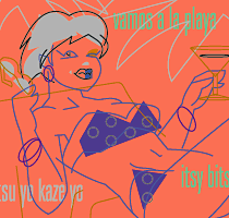
Illustrations 1987-2006
Joachim Müller-Lancé
“Form follows function”? This time-worn and often misunderstood approach found a recent alternative in “Form calls for content”. It seems to make better sense today—yet, the internet quickly deteriorated the term ‘content’ into evasive newspeak for any agenda. So, I think "Form makes us ask for meaning." We are intrigued by new shapes and we yearn to figure out everything we encounter. All life carries this desire in its genes, to be in control of our surroundings. This is my paradigm for being an information designer, type designer, and cartoonist at the same time. If I focus on form and meaning, I can see how all design fields are connected:
Concept and origins:
Ancient ways of recording meaning began to connect us to each other, sharing
information, emotions and spirituality, passing our culture on to future generations.
Images were the first carriers of meaning: from cave painting, it was a quick
step to the first standardized symbols, and then to written language. The
hieroglyphs of Egypt, the Chinese Kanji system, and Mediterranean culture
all provide well-documented trails from content-filled glyphs to phonetic
marks. This transition seems largely a global phenomenon.
Expression and essence:
We still call all the shapes in a font “characters”—do we want
them to have personality? Meanwhile, the pictorial approach transformed into
our international pictograms—since writing is confined to language. Pictograms
take an interesting position between typographic characters and cartoons.
As for form, icons are closer to letters: like a typeface, a system of icons
needs to be all in the same style, in order to be identified as a coherent
system. As for meaning, icons may be closer to cartoons: Both are simplified
depictions bearing messages for quick recognition.
Time and abstraction:
The next larger space for expression is the aspect of time. Its purest form
may be the pictorial sequence, like in emergency instructions. A salute goes
to writing where all elements mix: From cave painting to modern comics, storytelling
has relied upon imagery for support. Actor ‘characters’ are joined
by typographic ‘characters’ for speech or drama: boom, shazam! gatan,
burun! Simplified for efficiency, but not always more primitive: Concise immediacy
may stir thought, while leaving space for interpretation and identification
with a good tale. Increasingly life-like communication in modern media is
not to the benefit of sharing meaningful essence. Intensifying literal “experience”
on a physical or emotional level is merely superficial stimulus, and distracts
from desires to take home deeper ideas for life.
Together:
Abstraction, essence, meaning: Between my disciplines of information, type,
and image-creation, I see what this diversity has in common. Cross-pollination
not only creates interesting hybrid work, but also helps define a deeper sense
of consistency. “A picture is worth a thousand words”—but a
single word can evoke as many images. There is no separation between image,
word and letter—nor between spiritual and pragmatic, or fun and serious.
All elements are companions for meaning. Let's respect and enjoy that, and
keep going.
Joachim Muller-Lance graduated with honors from the Basel School of Design in Switzerland and studied Fine Arts at Cooper Union in New York. He has been a senior designer at Access Press/The Understanding Business New York/San Francisco, designed cultural exhibitions and publications related to the 1992 Olympics in Barcelona, and was Lead information designer for Barclays Global Investors in San Francisco for 3 years. He received the Gold Prize of the 1993 Morisawa Awards for his "Lance" typeface family, and two awards for his first Kanji and Latin typeface "Shirokuro" at the 1999 Morisawa Awards. Since 1997, Joachim is principal of Kame Design, for graphic and information design, typefaces, cartooning and animation.
www.kamedesign.com
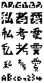
left side:
fonts:
Pesaro Roman
Fleisch Wolf
TX Monodular Square Bold
Shirokuro Nishi
Shirokuro Higashi
Tonkarari
Nichiyou Daiku
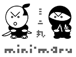
Mini-Maru Samurai
Mini-Maru Ninja
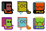
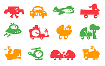
icons / illustrations:
Localmatters.com (w/ Fangohr LLC)
Wired magazine Infoporn
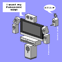
Panarobo-kun & Sonico-chan, Toolbox mascots
(w/ Fangohr LLC, Renegade Marketing)
Mini-Maru Samurai & Ninja
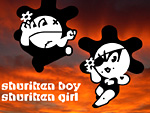
Shuriken Boy & Girl animation
Lotus software icons (w/ M.A.D.)
Lotus intranet icons (w/ M.A.D.)
Typebox icons
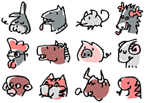
Chinese zodiac icons
right side:
PBD Smart Yellow Pages (w/ TUB)
Pesaro Pi-font
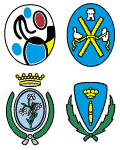
Barcelona district shields
Salesforce interface icons (w/ Hot Studio)
FontShop calendar page
Signal Signifier Pi-font
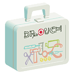
Ouch! font sample art: toy
Ouch! font sample art: CD
Tsunami Aid Fleuron Pi-font
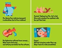
TinyTim board game
Sayonara Miki-chan party
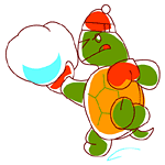
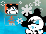
Kame Design winter greeting
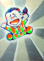
Happy Yotaro painting
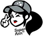
Super Ann mascot character