< back to kame in may 2001
< back to home
see related press:
> page magazine jan 01
> page magazine oct 01
> etapes magazine oct 01
form magazine
germany's classic since 40 years
may / june 2001
california special issue
article by gerrit terstiege
art direction: sarah dorkenwald
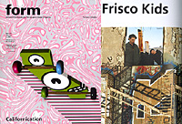
Frisco Kids
It was a Texan who, in the 1990's, made California graphic design famous worldwide. Today there is not much to be heard of the surfing sunny boy who seduced the readers of Beach Culture and Raygun magazines. David Carson has now moved eastward to the city that never sleeps. And the trend of mixing and modifying fonts ebbed like a wave from the shores of Malibu.
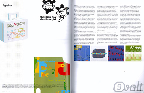
Two typographers and graphic designers, Joachim Müller-Lancé and Mike Kohnke have a motto that could be considered a side-swipe at Carson: "Unusual but useful". That is how the fonts that they design and market over the internet should be. The two have been friends for over ten years and are now working together enthusiastically to make Typebox.com a small, but fine address on the big, wide Net. Each of them continue to follow their own projects: Kohnke demonstrates his competence in web and corporate design on the website weassociated.com, while Müller-Lancé displays some surprsing animation and comic illustrations on the website kamedesign.com.
Müller-Lancé studied in Basel with Wolfgang Weingart, and so far has received two Morisawa Awards. His business partner, Kohnke, studied geography at Western Michigan University, specializing in cartographic techniques. Last year he graduated with a Masters degree from the California Institute of the Arts in Los Angeles.
The profound professional knowledge these two designers possess is now being used for the benefit of visitors to Typebox.com. Here you can find essays on particular fonts, or an interesting portrait like the one on the legendary American typographer, Oswald Bruce Cooper. Without a doubt, this is a useful site. And unusual besides.