< back to kame in september
2001
< back to home
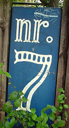
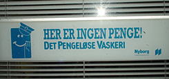
type design:
with vernacular lettering and
pixel fonts being all the rage,
the danish are far ahead
by harking backwards.
we stand in awe.
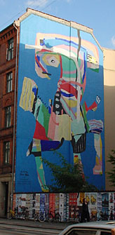
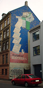
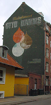
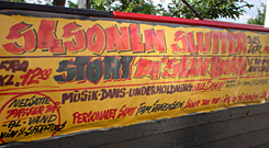
advertising is art ...or was.
we sure hope the witnesses from the past (on the left) will receive preservation, as the mural on the right seems to indicate continued interest in quality displays on firewalls.
go denmark!
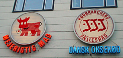
mascots:
so glad that karoline the cow is still among
us:
since the 60s she has advertized
"prima prima kaese aus daenemark"
all over europe -- but just what's the word "mad" got to do with
a little cow?
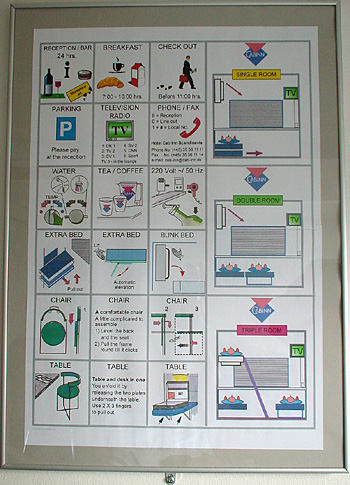
information is art:
the flagship of this page.
a hundred options to swivel, fold out and collapse the facilities and amenities, adorning the wall in lieu of art, in the minuscule rooms of our "mid-range" hotel
yes, we had the impression that the danes have very large bottles and small hairdryers ;)