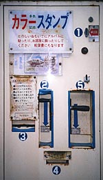
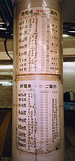
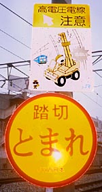
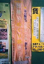
view more presentation pictures (large download)
view pix and tales from the conference
view announcement article
< back to kame in november
< back to home
> to more info-design thinking
How it started
I have traveled to Japan 3 times, each time for several weeks. "Look for the details" said my seat neighbor on my first flight. I did, and saw things that i had never expected. In a country with so much high-tech, people do so much with their own hands.
Nobody ever told me about this. Not the books, not the magazines, not television. Why? These things are not fancy. They are too modern to be folklore: Not enough for vacation or business.
As a visitor, I love the same things that everybody loves, but then I want more. I look for my own "special interest", my own entrance to the culture. I cannot settle for naive fascination; i get curious. Understanding is a deeper pleasure. So, i look for the details...
Many things i collected I don't fully understand. I grouped everything by appearance and use, and made assumptions. I will ask questions and "think aloud" as we proceed. I look forward to clarifying these thoughts in the discussion afterwards. Please help me with your knowledge.
This collection may always grow; of course it's never finished. With 300 pictures so far, this should become a book, like "Tokyo Lifestyles". I'd hope to find an interested publisher. If you find interesting examples, please help by sending them.
What is all this?
The day of our "informationscapes"
roundtable is: Information design ENVIRONMENTS.
My environment is: The physical public, the street, the public building, where
unknown people need to get along.
In Japan, people create design for their community, to make everyday functions go smoothly. And they seem to enjoy it: I can see care in the work. It seems unique to me, so i started collecting.
Many cultures enjoy doing handmade design. San Francisco has a lot of handmade design on its streets, from people who are not designers: but most of this is created for private business, not for public or social interest.
In information design today, there
is: public interest / commercial interest.
In the US, i live in an environment where information design is mostly:
professional, commercial, digital.
What i found in Japan and show here, is the exact opposite:
amateur, public, analog.
That is what i enjoy here. After 12 years of applied computer work, this research is a new field of interest for me.
All design is subject to entropy. The more order we try to create, the more unpredictable reactions follow... "things bite back". New information creates new misunderstandings. New inventions have new mistakes. Design reality is not always success, but mostly mixed...
The desire to repair, correct, update these shortcomings, as shown in my examples, is remarkable. We are presented not with complaints, but constructive fact. Much seems left to be done, but there are interesting solutions.
This is merely a report, to open
a new field to design research. It is still far from a clear analysis.
First, to open interest, raise awareness, for a phenomenon that is as entertaining
as it tries to be useful.
It is about the human factor in public design, as human as it gets.
I prepared this for your consideration, and further discussion together. To bring it into presentable shape, i have developed my own classification, by closely following the material i found.
Structure:
Introduction:
Compare US / Japan / Germany
Chapters to examine aspects of
design:
(a navigation bar will indicate where we are).
Process / design methods: Official
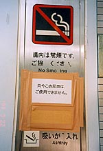
designs, altered by users: e.g. of obsolete, incomplete installations
Original handmade design:
written, drawn, painted, collaged
In-between-forms: semi-professional range, desktop publishing
etc.
Management of space:
Verticality: scarcity of space in Japan, and vertical
alphabet
Cluster: organic groupings of coincidental contents
Concepts:
Lettering
Maps
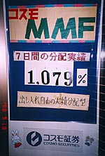
Chart / schedule
Orientation / direction
Process / instruction
Warning / prohibition
Interfaces
Elaborations may include:
Summary: why
is this subject/ category/ aspect important?
Comparisons to official information
Secondary aspects: devices, methods, styles, quality:
what is typical? why?
Compare extreme designs
A "masterpiece" or entertaining closing piece
In the roundtable discussion could
be examined:
How could professional design, repair/ updating, original popular design be
integrated?
What could professionals do in their work, to provide flexibility, customization,
reduce visual conflict?
Suggestions and requirements for administrations, designers, users?
Usability / Quality / Qualification
Most non-professional designers seem to use design elements/ devices which they may have seen in professional design. But they also invent their own, if no appropriate example is known.
In many examples, it is obvious
that people had fun and enjoyed themselves. In other examples, the task was
serious and difficult for the designer, but he was interested to spend effort
in it.
Levels of sophistication
vary wildly. There is a full range of skill levels, often semi-professional,
especially when desktop publishing is used.
Some examples seem quick and not careful. But is it good enough? Does it serve its purpose sufficiently? Attractive look, sophistication and quality depend not only on the creator, but also the audience. Is it good enough for them? Enough information for them to understand? Can they use it well enough? Will they like it enough? "Individual beauty in the moment"...
What's in it for the audience?
Dear visitors: Open your eyes. Look out for these things as you walk around: You might find some other interesting ideas. It may be surprising, endearing, and entertaining to scout around.
Dear locals: You have seen most of these things every day, but never so many together, in a comparative order, in a collection. I have often heard of interest in hearing how foreigners perceive your culture.
Please understand what i am trying
to do here. I was helped by Japanese friends, who are dissatisfied with public
information, and like the resulting private initiative.
Showing "unattractive" designs may be unpleasant, because they reveal that
something is missing in official public design. But people's initiative in
public design here is unique, and an example for others.
What they do is a good start. Improvement is possible. If all help each other a little, it may be a leading example worldwide. My overview wants to suggest getting together, talk, show ideas: Exchange and cooperation could be started between people, professionals and authorities. (Field trips, informal classes, tours of studios, organized by the communities or schools?) The people learn about design thinking and technique; the professionals could learn about all the needs and tasks out there...
[Other aspects may come up in discussion or Q&A]
...more pictures? they won't disappoint. but make time for a large download...
international conference
on information design
tokyo, 07-09 october 1999
diversification
of minds -
conversation in processes:
design for communities
