.
> see the award ceremony
> see morisawa's
print announcement
> see morisawa's
web announcement >>
> kame's poster "mainichi
kame-iro"
> kame's new year card
< back to kame in january
2000
< back to home
honorable mention
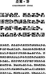
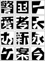
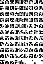
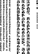
for "shirokuro higashi (east)",
kametype's first kanji typeface.
check the upcoming issues of U&lc, Graphis, Eye and other design magazines for the official announcement from Morisawa.
(in japan, see
Tategumi-Yokogumi)
1999 morisawa awards:
2 prizes for kametype's first kanji / roman
joachim muller-lance's designs
* reproduction or duplication prohibited *
Designing Kanji has been a longtime dream for me. In Shirokuro, my first Kanji, I hope to combine my love for "figure-ground", pictogram and type design, and language studies.
Many thanks to Akira Kobayashi for his advice on Kanji and kana, and to Aisei Language Services for teaching me Japanese.
- jml
Shirokuro, "black-and-white", belongs together naturally.
Like the yin-yang, each shape depends on the other; only together they convey
meaning.
In the same spirit, it seemed natural to develop Kanji and Latin together. Shirokuro¹s cut-paper look intends to challenge and entertain like a puzzle -- and, it seems to ask for bright colors.
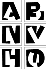
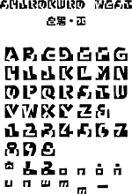
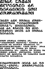
"Shirokuro West" is designed for combined setting with its Kanji counterpart "Shirokuro East". Therefore, it is monospaced and based on the square used in Kanji design. However, it is also intended to be usable for Latin-only display setting.
This Latin version was the original idea, of 1993, for playing with positive/negative shapes within each letter. Yet, it took completing the Kanji version first, to then finish the Latin alphabet swiftly.