Japan
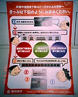
5: Japanese ticket vending machines. With several
private lines connecting to public lines, it is amazing how millions of users
accommodate their habits to arbitrary interface idiosyncrasies, which only manifest
competition between the companies involved.
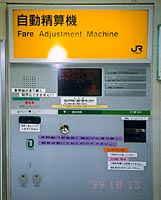
4:
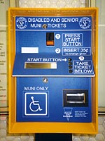
A separate machine for senior and disabled tickets just goes to manifest its
unrelated origins. And why is this machine in a corridor 50 meters away from
regular ticket vending?
article for AXIS magazine, tokyo:
issue 5/6, may/june 2000
feature "getting
there, getting things", on interface design
reproduction or duplication prohibited
Interface of vending machines
San Francisco
1: San Francisco uses two transport systems:
MUNI for the city and BART (Bay Area Rapid Transit) for the greater area.
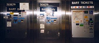
The three machine types currently in use by BART, the regional transport authority.
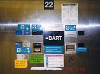
2: Typical old interfaces of BART: What started
as an illogical layout, has become worse through improvements.
3: Different but not better: BART's new machines.
Users show major confusion especially about the two display screens, and hardly
use this new model at all, although it allows for more options including credit
cards.
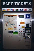
No
improvement from machines old to new:
Obviously, engineering has to prioritize their clients' space-saving desires,
over a time-saving interface with a natural operation sequence for all. (Required
ruggedness aside, a multiple of this functionality fits into a minuscule palm
pilot, with a better interface as well.)
Isn't the ultimate task of public transportation to be time-saving and user-centered?
Do engineers enjoy convoluted logic like designers enjoy questioning legibility?
Or: who makes the final decisions?
Vending by humans
7: Protection from unwanted
exposure? "Is there a human in here, please?" East or west, ticket booth employees
rig up their turrets with random information like medieval battlements. This
seems to protect from reiterative inquiries, comparable to a web site's FAQ
section.
Seeing
these pictures together, one can imagine how thousands of people lose time,
energy and good will every day, be it for work or their own life. Businesses'
loss of efficiency and people's frustrations may lead to more tension in society.
However, problem recognition, initiative and good will are clear to see. What
the transport employees tried to fix here, inadvertently reveals where professionals
and administrators failed. Be it by professionals or amateurs, all these examples
are obviously "designed", often several times over: Choices and decisions had
to be made -- but involuntarily or unknowingly unrelated.
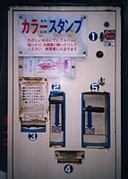
6:
Vending machine for memorial stamps in Nara: In souvenir machines like this
one, it's a lot of fun to be involved in absurd actions and patterns -- proven
by mechanical museums in tourist venues. An ironic symbol: What we find obstructive
in task-oriented interfaces, becomes entertaining in leisure travel!