> see pictures
of vending interfaces
> see pictures
of demonstrating process
< back to main text
of article
< back to thinking
< back to kame
in may
< back to home
article for AXIS magazine, tokyo:
issue 5/6, may/june 2000
feature "getting
there, getting things", on interface design
reproduction or duplication prohibited
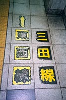
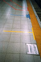
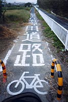
Guiding people and traffic
Signage at eye-height
16: After maybe a century of public transport,
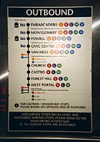
San Francisco just introduced a color-coding system that is useable (so far
only at its central Embarcadero Station), including palpable embossed symbols
and braille.
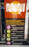
17: However, people who see will be more confused
than the blind: Right at the entrance, MUNI's previous attempt at color-coding
is still in use. A world design metropole having a consistency problem with
only 5 lines?
