> see pictures
of vending interfaces
> see pictures
of guiding people and traffic
< back to main text
of article
< back to thinking
< back to kame
in may
< back to home
article for AXIS magazine, tokyo:
issue 5/6, may/june 2000
feature "getting
there, getting things", on interface design
reproduction or duplication prohibited
Demonstrating process
Electronic
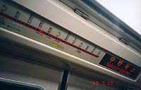
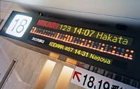
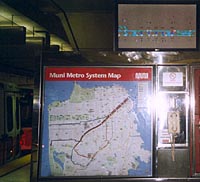
8: In its central station, San Francisco's MUNI
has introduced a status display for its subway car positions: Hopefully, this
is still just a test. How can users possibly relate the tunnel diagram to
the map underneath, which is differently simplified?
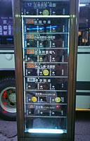
9: Kyoto's well-working system to indicate approaching
buses: This electromechanic approach seems more appropriate than a screen
display.
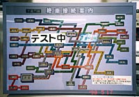
10: A display "in test", found in May 1998 in
the Tokyo subway. It shows the positions of the last trains in the entire
system, 2 years before and better than San Francisco. (But why the diagonal
style?)