.
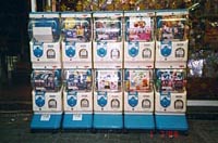
> see pictures
of vending interfaces
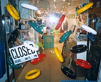
> see pictures
of demonstrating process
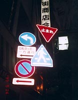
> see pictures
of guiding people and traffic
< back to thinking
< back to kame
in may
< back to home
Design through entropy: Nothing is final
Joachim Müller-Lancé
The present situation of information design and access design
To begin: I currently see confusion about what the term "information" should denote. Certain groups seem to have an interest in bestowing this valuable and respectable title upon any piece of data that flies around on the internet. This comes to the detriment of others who hold fast to its original sense. Discussion becomes evasive and pointless if there is no clear consensus of what the term stands for. I appreciate freedom of expression, but data is no information yet.
As opposed to opinion or persuasion, "information" should be narrowed down to communication and resources that actually emancipate the user from confusing situations and sources, and offer him independence in his processes of decision making. Its nature should be unbiased, countering emotionality instead of manipulating it. It provides the building blocks of education. Public information has the hardest, most unrewarding and undersupported task of all.
Public administration is expected to satisfy all competing groups: individual interests, economic interest, social interest - and even competitors within each group. As no one is satisfied with mere equilibrium, no one gives gladly to its source. Still, this may be a more acceptable situation than having any group dominate.
Comparing the nature and tasks of public and commercial communication, we
find the dichotomies of survival vs. pleasure, needs vs. stimuli, education
vs. persuasion.
Commercial interest is in proactive growth, creating large budgets to be reinvested
into attracting even more attention through perpetual change and excitement:
an upward spiral if it works; if not, bankruptcy.
A government cannot allow itself these risks, having to provide stability
to all. Its limited means require long-term efficiency in facilities as in
communication: Learn once, use always.
What problems are there, and why?
A phenomenon that physicists call "entropy" claims that all nature tends to more disorder, a lower level of energy. The organic processes (or, awkward evolutions) in my examples seem to indicate that a single effort to establish order causes a range of "entropic" effects, to which no flexible response, no window for change was prepared. Establishing consistency "from above" seems to almost go against the nature of society.
Usually, we even know already that it won't come out perfect: During development, our best intention inadvertently competes with many other factors and concerns - technical, political, commercial, budgetary; available information, qualification, and timing. All has to squeeze into the "bottleneck" of a single result which, once implemented, fans out a range of effects reflecting both improvements and unsolved problems of its development. We're only human, so our machines have human problems. Our audience is also human, and they get the problems. It is amazing how grateful and forgiving they already are.
Why does every car door and safety belt have a different design for opening it? There seems to be a conflict between aesthetics and function. Of course we love to be acknowledged for having to put our hearts into our tasks, but we need to keep our artistic side in check. Be mindful of making a project only look like information. Trying to solve new problems by focusing on requirements will result in original new solutions that may surprise us creators too.
What should be in the future?
Maybe we don't need to create anew, but first see if we can recombine what we find? My examples seem to show we often only need to analyze and rearrange what is already there. Obviously, in most cases it takes more research of all givens, coordination and long-term thinking, and then still: maintenance. While the administration might gladly cooperate, such additional work might yet need to be budgeted.
Need seems for expandable systems of more organic or adjustable structure, providing options to update and expand the content: Unforeseen incidents can stay in control by allowing them space and direction to move and grow within your system (for instance, modularity is one of various helpful approaches).
What can designers do?
"Make it simple"? No! Keep simple what's already simple, and clarify complicated information without losing helpful details. Respect your diverse audience: Provide a simpler path, and then more detailed access to individual needs.
Create structure, make visible how things relate. Break large data up, group related things clearly, give extra attention to very clear typography and hierarchy. Take initial fear away by providing an inviting environment.
There is no such thing as "detail". Small things can be as important as big things: a single pixel can determine readibility.
Last not least: Creativity works in reversals. What can you reverse or turn upside-down for a try?
The digital side
The internet is merely the latest manifestation of the reverse side of our exciting progress, unpleasant for many of us who hope for the classic satisfaction of a finished, ever-functional solution.
Who do we design for? Who is information for? Technology changes, but people
are always human. Everybody has different knowledge, different access to information,
and different means: Will some people have no access in the future?
"Interactivity" must mean choice. It is in our hands to offer different "doors"
to information - with a face that is understandable and useful to all.
In practice: What changes? In your medium, find what's different from other
media, and use that to the maximum. It is true that new media can stimulate
or trigger new ideas to overcome old problems - but can as easily create new
problems.
What stays? Keep in mind you always work for the human senses.
Society grows, flows, changes: IN PUBLIC INFORMATION, NOTHING IS FINAL.
But that should not make us become shallow.
Recommended reading:
Loretta Staples' recent "Myths of Information Design", Critique magazine,
Winter 2000


ac·cess, n.
[Middle English acces, a coming to, from Old French from Latin accessus, past
participle of accedere, to arrive.]
-The means, place, or way by which a thing may be approached, entered, or
made use of; passage way.
-The act of approaching. A coming to, or near
approach.
-The right to approach, enter, or make use of; admittance; admission; accessibility.
in·ter·face; noun. Date:
1882
-A surface forming a common boundary between adjacent regions, bodies, substances,
or phases.
-A point at which independent systems or diverse groups interact. -The point
of interaction or communication between a computer and any other entity, such
as a printer or human operator.
-The overlap where two theories or phenomena affect each other or have links
with each other.
-The place at which independent and often unrelated systems meet and act on
or communicate with each other.
Joachim Müller-Lancé graduated with honors from the Basel School of Design in Switzerland and studied Fine Arts at Cooper Union in New York. He has been a senior designer at Access Press/The Understanding Business New York/San Francisco, designed cultural exhibitions and publications related to the 1992 Olympics in Barcelona, and was Lead information designer for Barclays Global Investors in San Francisco for 3 years. He received the Gold Prize of the 1993 Morisawa Awards for his "Lancé" typeface family, and two awards for his first Kanji and Latin typeface "Shirokuro" at the 1999 Morisawa Awards. Since 1997, Joachim is principal of Kame Design, for graphic and information design, typefaces, cartooning and animation.
www.kamedesign.com
joachim@kamedesign.com
Since 1998, Joachim has researched public information design created by non-professionals, especially in Japan. He lectured about this subject at the visionplus7 conference of IIID International Institute of Information Design, October 1999 at Tama University Tokyo.
"Public information is often ignored because of its unimpressive, low-budget, or bureaucratic shortcomings. Yet, in some people involved, it triggers individual, unpaid initiative. If we understand and enjoy their inadvertently entertaining attempts as being truly human, we can find a more caring and constructively-critical way of looking at the underlying problems, which they naturally expose."
article for AXIS magazine, tokyo:
issue 5/6, may/june 2000
feature "getting
there, getting things", on interface design
reproduction or duplication prohibited
Interactivity means CHOICE.
In languages, the simplest and most-used words are often the most irregular, worn from manifold use through history.
So are the most-used, commonly shared interfaces.
They seem the least controllable, and therefore, the most idiosyncratic.
