> see part 2 of this article
> see article
on interface design, AXIS tokyo 2000
> see presentation
on vernacular public design, visionplus7 tokyo 2000
> see article
on tax form design, Publish USA
1994
Information design emerged as a new and distinct discipline about 10 years ago. But it's always been embedded within graphic design. Who can design without implementing given information such as diagrams, pictograms, maps or charts in their work? And what designer hasn't thought about how to make these elements work better?
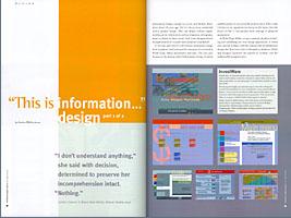
In this two-part article I will discuss information design both in general and from specific examples of our work at Wells Fargo Nikko Investment Advisors. The first part focuses on the human side of information design: the flow from client to designer to audience, Creation and Reception.
Client and designer represent the aspects of creation, and the audience the reception side. It may seem theoretical, but it offers what I believe is an important backdrop to the more concrete focus of Part 2: the process from concept to physical appearance.
C r e a t i o n
New ways to work with clients
To put things into perspective -- information design might have a reputation of idealism and integrity, but ethical concerns remain the same as in any other design field. Its power is simply more political than emotional, since it can actually enable people to think -- but this potential always depends on a given assignment's content: An information designer may do great things for education and society, but another day he may also find himself asked to "improve" dubious material for more credibility -- if he accepts such work.
Close cooperation with the client comes in long before content is developed. We deal with design 100% of our time, while he may spend as little as 5%. Equally, I don't know much about what he does. This is actually an asset: if I am ignorant, I need to ask a lot of questions which help me make the content simpler for the public. Vice versa, I can bring up many concerns on behalf of the audience, which a specialist such as my client might not have considered.
Finding superior solutions first requires listening, and trying suggestions out. If you then see a better approach, you will have to clearly prove its advantage, usually in comparison with what was ordered. Be warned -- this may end in twice the workload of what was ordered, if not planned for.
Finding the right designers
Increasing need for teamwork can be observed in all disciplines as they grow more complex and international. In information design especially, this need requires the intelligent selection of appropriate professionals, and careful composition of staff groups. New work processes need to be devised that are more open, modular and systematic, but without loss of the human appeal.
An information designer has to be convinced about the content; the project's intentions should be compatible with his. The less a designer knows about the subject before the job, the better. Once he has figured it out by himself, he will be able to convert that experience into a form that can be shared with the audience. True information design requires responsability, and a desire to educate and cultivate, rather than merely train. Latin "educare" means "leading [people] out" (implying "...out of an unknowing state of mind"). It is a desire to create more independent and able minds, rather than making people dependent on what you give.
The more differences I could observe in design education and practice in different countries, the harder it is to give very specific advice; but some general thinking will apply everywhere.
Common sense is indispensable in any contributor. Information designers are not specialists, but generalists! They need to dispose of a variety of cultural and professional experiences, since they have to recognize and communicate the relations between the concepts they deal with.
If composing a team, judge applicants by their attitude towards solution-finding, rather than superficially impressive skills. As you review, this may include watching yourself and comparing what you are immediately impressed by, versus what may be more appropriate for resolving the problems at hand. It takes certain practice to recognize somebody's capability to resolve intellectual challenges.
Composing multidisciplinary teams that complement, not compete, is like designing a community. Fighting over solutions can be quite productive, but fighting for a better position in a hierarchy takes away from energy better used for the project itself. Everybody's function should be equally necessary for all other team members. An efficient team includes not only designers, but equally the printer, programmer or other producer. They can provide valuable feedback and suggestions for a process that may have to remain as open as possible until the end, to provide a closer-to-perfect solution. Certainly, this requires getting the team together early -- and getting them to talk to each other early.
Design schools have felt the impact of the new demand for information designers, and they've had time to react. But how they have reacted may be a function of the difference between what have been characterized as "process schools" and "portfolio schools."
The key to this difference is whether a student can merely illustrate content or actually structure and organize it. Portfolio schools are oriented more toward the one-off approach to single, unrelated tasks and issues of style, and to manual or technical skills. Process schools tend to have a more restrained curriculum, less of a buffet style, since their courses are typically more interrelated, and their projects may span several classes or terms. The graduate of the process school may be less fluent in an immediately perceivable technique but is often capable of understanding the larger, "invisible" aspects of a given project.
Working with your colleagues
The first issue in question is the traditional, linear workflow of handing a project down the assembly line. There shouldn't be any "first" and "last" person in the sequence. Everybody in the process is also an audience -- and should give feedback on flaws or problems they find, or new ideas they have. Provide for intellectual exchange -- the writer is a layman to design, the designer to research, but they may all be each other's best critic. Encourage mutual inspiration, and giving any idea at least a short try.
Documenting the design process is not just a nostalgic attempt to keep memories of edifying experiences. It can, for instance, show the client what efforts were made and how; and to future clients, it may be a better portfolio than merely showing the published results could be. But since information design is essentially a form of education, an information designer may quite naturally develop a certain desire to offer his useful findings and experiences in some form of teaching -- to educate future colleagues at art school, or simply to familiarize a newly-hired colleague to the team's methodology.
Designing is not a regular-hours job. Inspiration cannot be extracted out of a void, but comes from somewhere inside our process of trial and error -- if we keep your mind open. There are methods of obtaining ideas from one's own mind; approaches to tap one's own thinking, often some sort of "serious playfulness", the ability to play purposefully with what you have to deal with. Why not work on all current projects at the same time? It is demanding, but that way each project may profit from the ideas of the other ones. When something upsets me, my mind gets busy, not tired -- a nuisance should be a creative challenge.
Everybody involved should be given proper credit. Information design may seem just a service, but it requires every contributor's personal input. We are self-motivated as long as the project remains not just interesting, but personally rewarding. Recognize everybody's efforts; stimulate and give feedback. And, provide insight into your part of the process, with concisely organized thoughts and concepts. Keeping the development visible in a common area is always a good idea.
R e c e p t i o n
Now what to do with that audience...?
Like entropy in an expanding universe, information increases and circulates ever more widely. The wider the circulation, the more pluralistic the responses and also the problems. As information is stripped from its original context, fragmented, and creates its own new context, meaning and value shift. Raw data, factoids, or advertorials may amuse, distract, or entertain us -- for the moment -- but they are not information, and their value does not persist. As our ability to communicate increases by leaps and bounds, does our ability to process information keep pace? Or do we simply spread ourselves ever thinner?
It is easy to place blame on the medium, but the real scapegoat is the user and the creator -- all of us who allow surface to replace substance. As designers we have the power and the responsibility to influence the medium. We either direct the technology or we become its pawns.
The current changes in communication will easily match or even outdo the impact and outgrowths of inventions such as the car, or television. Common sense has to be applied from the beginning -- not emotionalization. Unlike car and TV, the computer provides the potential to be productive, and for us a chance to get active. Our foremost task will be to bring things into context to each other, to relate, compare and connect; in order to not only compensate but actually counteract inanity.
Respect your audience: Many times, we are confronted with the problem of communicating complex content to very diverse audiences inside one piece. No matter if you try to dumb content down for one side, or to keep it demanding for the other, you'll lose readers on both sides. A proven good solution is to offer information broken down into several levels of intricacy, not unlike the "easy" and "advanced" modes of many softwares.
You and your audience consist of human beings; your
perception mechanisms will always work the same. Nature has refined both eye
and brain through millions of years and thousands of preceding species --
how can we possibly expect all our progress to actually change us that easily?
Still, conditioning is never just superficial either. It just goes to show
how much flexibility nature has built into us, providing adaptability to survival,
and a rich pool of variability for further evolution. That is yet another
argument for respecting and appreciating variety per se in any audience. A
diverse and flexible audience is not an invitation to manipulate, but a chance
to contribute to our development.
Special thanks to Greg Galle and Thom Grizzard for all their help.
> see part 2 of this article: A hands-on demonstration of the workings of information design.

www.kamedesign.com
joachim@kamedesign.com
reproduction or duplication prohibited
Information design, part 1 of 2
Joachim Muller-Lance
"I don't understand anything," she said with
decision,
determined to preserve her incomprehension intact.
"Nothing."
Lenina Crowne in 'Brave New World', Aldous Huxley 1932