>
see article
on interface design, AXIS tokyo 2000
> see presentation
on vernacular public design, visionplus7 tokyo 2000
> see article
on information design, IdN hong
kong 1994
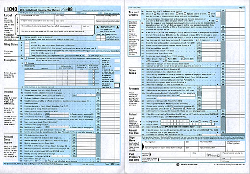
In 1994, Publish magazine, San Francisco commissioned a redesign of the US Individual Income Tax Form to three information design studios: MetaDesign, Thom Lepley, and myself.
Since government forms reach the largest and most diverse audiences, I look at such projects in an ignorant way: the less I know, the easier it is to find the problems.
The first step was to question the assignment itself: not only the appearance, but the concept and structure needed redesign: Start with the most difficult, and the rest falls into place.
The content breaks down most easily into: personal and financial information, and obligations to pay versus options to deduct and save. All this was indistinguishably intertwined in strings of legalese -made rather for evaluation than for ease-of-use. It had to be untangled and reshaped into a user-centered solution.
Personal information went to the beginning, followed by a consistent string
of financial information. The language had to be rewritten and broken down
into understandable pieces.
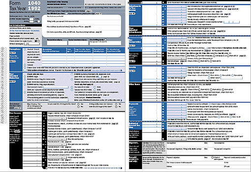
I reassigned the existing colors to indicate Tax Savings versus Expenses:
the entire form can still be photocopied well. For recognition value, my form
retained its traditional blue color, distinguishing it from the green EZ and
the pink A form, and is set in Franklin Gothic, already used in other government
forms. White fields for data entry were kept, but different shapes now indicate
writing-in versus checking-off. Other treatments link references within the
form to those found in the accompanying workbook. Pictograms proved of no
use for financial terminology.
I was pleased to see that my competitors had approached the problem in quite
different ways: even such a functional assignment resulted in expressing each
designers' personality.
Our different results also make it clear that cooperation with the government
would require a combined effort from all of us, which I would welcome.
www.kamedesign.com
joachim@kamedesign.com
Improvement through ignorance:
Redesign uf the 1040 U.S. individual income tax form
Joachim Muller-Lance
(originally published for the visionplus7
conference, tokyo 1999)
reproduction or duplication prohibited