

presentation script
see below
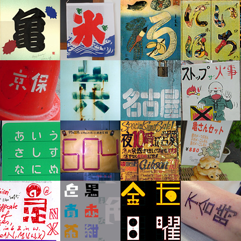
scroll
scroll
scroll
...
ATypI
2002 in rome, italy
19-22 september 2002:
"symposium on multilingual typographic issues"
Crossover type design culture:
Designing Kanji with Latin eyes and vice versa. Presenter: Joachim
Muller-Lance
Principal, Kame Design; Partner, Typebox, LLC.
Introduction
Since my first 4-week visit in 1997, Japan has intrigued me more than enough to keep studying its language since then, and to try my hand at designing Japanese type since 1999. This year, 2002, I finally dare/enjoy sharing my cultural and inner journey with a larger audience, at TypeCon Toronto and at ATypI Rome.
Japan - the country
Japan's area is roughly the size of Germany, or the US state of Montana. Yet, only about one-third of it can be inhabited and cultivated, by a population of half the United States', or 60% larger than Germany's. Hence, Japan's physical population density might be 3 times as high as its statistical one? In a tight space, getting along with each other is paramount, which requires a civilized and organized society, and a culture and education to build and maintain it.
Japan's four writing systems
Written Japanese is an intriguing mix of 4 writing systems: Chinese "Kanji" characters imported since 400 AD, and 2 parallel phonetic sets of syllables called "Kana": the biomorph calligraphic Hiragana developed from 800 AD on as a popular script especially used by women, and the less curvy Katakana: a shorthand devised by Buddhist students and - aside from ongoing use in science - used for emphasis, sounds in comics, and the increasing amount of foreign words (not unlike Western italics). Its simple shapes are also most apt for lowest-resolution display such as cel phones or cash register slips. - Latin words or abbreviations can be observed in commercial, technical or scientific contexts, where transcription into the limited Kana syllabary may be inaccurate. - Numbers are nowadays also mostly Indo-arabic, though the old Kanji numerals still appear in traditional or folkloristic context. (My comparison may limp in many aspects, but intuitively, I tend to liken Kanji to upper-case Roman letters, as the oldest part where it all started from: The official, institutional, most geometrically-constructed system, up until present day. - Then came Hiragana, simplified for everyday people and casual fluidity: Like Latin lower-case, children learn it first. - Katakana may suffer similar problems as Western numerals: its seemingly-simple look tempts designers to treat it as an afterthought, but I learned the hard way that both need to receive their own kind of sensitive focus and special attention from the beginning.)
Learning Japanese
For venturing into Kanji design, you have to learn the language to a good extent. Type is always context; you need to acquire a working knowledge of written and printed styles, the rhythm of speaking and writing, possible glyph combinations, and other enjoyable revelations that come with exploring a different culture.
Learning Japanese is an adventure of the mind... it requires opening a new compartment in one's brain. Unlike the "learning curve" I know from acquiring Western languages more related to my own, Japanese presents a sequence of humps to be overcome and internalized. Truly an island culture that chose to live isolated for long (an independent empire since 660 BC), but not without influences: Related to the Ural-Altaic family that even includes Finnish, Hungarian and Turkish, but with a writing system originating from China, a grammar possibly related to Korean, and a charming sound and rhythm likened to Polynesian cultures.
The syntax seems partially reverse to Western languages (but not unlike classic Latin in my view). Once understood though, the basic grammar is pleasantly consistent like Lego blocks, with hardly any irregularities, and aided by the system of 50 underlying syllables that all words are based on. Yet, the resulting set of about 300 modified sounds available for the entire language is rather limited, and presents phonetic homonyms all the time. In listening, their semantic meaning can only be understood in context, and I am struck by the resulting talent of observing and understanding in my Japanese friends. In addition, most Kanji characters have two "readings" or pronunciations, "on-yomi" from ancient Chinese, and "kun-yomi" as the domestic word: maybe comparable to saying "ophtalmologist" or "eye doctor" in different situations, but writing them as the same symbols "eye + medic"?
To defy logic a bit further, Japan also enjoys its many local dialects. Like Italy, Japan has a high mountain range running down its geographic spine, historically separating the communities settled on both shores East and West, and different mentalities and attitudes ruling in North and South and inbetween. Just as Pasolini explored Italian dialects in his 'Decamerone', you can find linguistic idiosyncrasies in Japanese films, comics, animations etc. - and not only relating to regions: Gender, generation, or the slang of your social group or profession may even target a certain manga-comic to your interests, so you won't feel "left out" in a society that feels more necessary than the individual. "Context" seems to be the key word for Japan, in society as in language, spoken and written.
Learning Kanji design
There is no way to tell after how much studying you "know enough" of the language; you might just start sketching and keep going. I find Japanese type to be at my advantage because it includes Kana, which are not used in Chinese languages. I strongly recommend learning calligraphy in both Kanji AND Kana, since I feel it is a shortfall of mine, being left-handed. Even in constructed or experimental approaches, there are many situations that can only be resolved by understanding calligraphy.
Modern Japanese employs up to 5,000 Kanji characters, Chinese maybe 40-50,000. These are huge tasks, usually performed by teams. Complexity of characters varies wildly; the idea of "even color" only applies within certain groups or categories of glyphs. It is difficult to decide in every design anew, from which level of complexity on the basic stroke widths should be manipulated to which extent. Formgiving and surrounding space need to equally take vertical and horizonal setting into account. Both orientations are usually monospaced, which means spacing and sizing are quasi one and the same. Complex or boxy shapes are kept smaller, while simple shapes and protruding strokes may receive overshoot. - Kana are usually sized 10-15% smaller than Kanji, to facilitate visual distinction. Both Kana groups require special treatment in curvature, sizing and other aspects, to strike a balance between stylistic consistency and clear difference between the "cases" of this multi-system. In some recent typefaces, Kana have also undergone approaches at proportional spacing within horizontal setting, to save space, and because their shapes were not originally made for this orientation.
The Japanese combination of Kanji and Kana displays great diversity in color and texture - surprising to the Western eye, but a necessity for distinguishing its components. Western languages use prepositions, while the so-called "particles" in Japanese are post-positions. Japanese word-shapes start with darker Kanji "stems" to indicate meaning, followed by lighter inflections and "particles" inbetween, usually in Hiragana. In Latin, this would mean: setting words like "the, a, to, at, in, by, with, and" in a lighter weight and slightly smaller - and also endings like "-ing, -ed, -'s", or words like "would, shall, may, have" - and so on.
My own Japanese typefaces
Oddly as I experienced, advantages for an outsider may lie in ignorance of, but burning interest in, aesthetic detail and historical arcana (partially even unknown to my language teacher). My personal approach is about offering something different from the outside, while learning and respecting what is there. The results are appreciated in Japan for their curious freshness and different angle. I was told that my seeing these shapes as "images" is surprising - even though children are taught Kanji facilitated by pictures... but not the grown-ups? They think my efforts are refreshing, and provocative in a welcome inspiring way from the outside. I could feel how they long for breaking out, - but within a safely-expanding and astoundingly-flexible culture? Yet, my learning of the writing system itself will have to continue for a long time.
Shirokuro Higashi/Nichi (East/West):
Eastern calligraphy students learn Kanji/Kana as a sequence of strokes, just like Latin calligraphers. But in all writing systems, when it comes to letterforms for actual typesetting, there is an important focus on the in-between "negative" shapes of counters and letterspacing.
Shirokuro (meaning "black and white") takes this concept of "figure-ground" thinking to the extreme. All shapes belong together like the yin-yang. Every shape depends on the other; only together they convey meaning. In the same spirit, it seemed natural to develop Kanji and Latin together. This typeface pair brings together several years of type design, pictograms and logo marks, figure-ground practice, and Japanese language class. Its styling combines a fresh cut-paper look with clean computer screen rendering in straight lines. Shirokuro intends to provoke recognition and legibility like a puzzle, and hopes to reward and please everyone who understands that creativity thinks in reversals. And, it seems to demand use of bright colors. Both styles received Morisawa prizes in 1999.
In "multi-script families", all scripts should ideally be worked on at the same time from the beginning, in an organic process. In some phases, one script may become priority, but all scripts will always fertilize each other (of course this is more exhausting and time-intensive). Yet, my idea for Shirokuro originated 9 years ago in Latin, where it always seemed too loose to nail it down into final shape. I discovered that I had to go through the more demanding set of Kanji and Kana first, to find matching design rules for both versions. Once the Kanji/Kana paradigm was clear to me, the Latin version literally fell into place within 2 nights of work.
Nichiyou-Daiku:
This design was originally inspired by the folkloristic letters of a Taiwanese restaurant in Shibuya, Tokyo. However, as i progressed, my characters decided to develop their own oddball and dinky "modern" life, and reminded me of many things that intrigued me in Japan, which have also become a subject of my design research and lecturing: wondrous installations rigged onto telephone poles, wires crisscrossing, public signage, carpentry and engineering, homemade contraptions spotted in neighborhoods: functional but of purpose unknown to this Westerner. As i approached this typeface in the same feeling, Nichiyou-Daiku (the "sunday carpenter", or hobbyist) is dedicated to the do-it-yourself spirit of this culture.
To achieve a deliberately tinkered appearance, many details are done intentionally wrong, but consistently so: odd and emaciated proportions of horizontals and verticals stand against bloated round 45-degree diagonals, and bubbles for the so-called "ten" splotches and small hooks. boxes and triangular shapes contain round counters.
Katakoto (designed for Typebox LLC. by Akira Kobayashi):
"Katakoto" is a playful pun between "katakana" (for writing foreign words) and "kotoba" = 'words'. The word "katakoto" also means: the sounds that children produce when they begin to speak. Typebox designer Akira Kobayashi has come up with a unique new concept: a bilingual "word-font" using the Katakana system. Akira writes: "Very often I see graphics that use Japanese characters just to achieve 'exotic' effects, but usually it looks strange to a Japanese eye, because the text there does not make sense. For the designer who wants a 'cool' look and wants to give a message that is clear to him AND to Japanese, a 'one-word, one-key' might be useful, ne?"
"Lithium Katakoto" offers 26 words chosen for their everyday use in both English and Japanese, in one educational font. All words are represented in one-to-one translations between Japanese and English, and are organized alphabetically by their English initial: upper case = English words; lower case = Japanese translation. Type an uppercase 'L' and you'll get "love" (rabu); type a lowercase 'l' and you'll get "ai".
Closing words.......
Like I said, I still consider my exploration an ongoing adventure - but all dangers possibly waiting are of my own choice. Is that the pleasure of learning? I feel rightfully intrigued, and I will keep going. - Supposedly, Picasso said: "I don't search - I find", and he desired to "paint like children do". Yet as I observe children, they take their play much more seriously than we adults think. Whenever I was able to play freely with my means, while pursuing serious ideas in a questioning manner, always creating new things to examine curiously, the results have helped me to achieve and own the best things I have today. - Let's play.
Joachim Muller-Lance
.