what's new:
shuriken
boy and shirokuro
on increasing airplay...
while originally
published in the US by adobe,
shuriken boy enjoys growing popularity in japan
and europe!
how come?
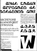
instruction for shirokuro, 1999
(translation: akira kobayashi)
kono romaji shotai wa, "shirokuro higashi" shotai
to
issho ni tsukau mokuteki de tsukurimashita.
sonotame, moji no haba wa kanji to onaji seihoukei de,
ittei no okuri ni natte imasu.
mochiron, oubun dake no midashi no kumihan ni
mo shiyou dekimasu.
this latin typeface is designed for combination
with its kanji counterpart "shirokuro east".
therefore, it is monospaced
and based on the square used in kanji design.
however, it is also intended to be usable
for latin-only display setting.
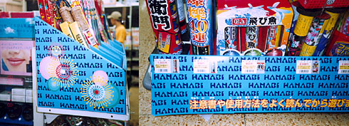
japan in summer:
"hanabi" (flower-fire)
stands for japan's summer fireworks.
the "lawson" chain
of 24/7 convenience stores
used shuriken
boy
to boost sales of their firecrackers
at every corner in japan.
> more shuriken boy in japan
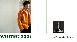
germany in winter:
men's fashion designer
ralf handschuch in berlin
used shuriken
boy
to announce his winter collection
at the "koelner herrenmodewoche" (men's fashion week cologne).
great to see
kame's corporate orange
will be the rage for us guys
this winter...
> more shuriken boy in europe
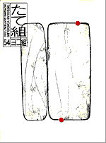
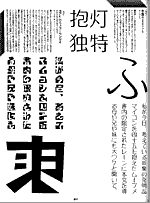
east & west in black & white:
morisawa company's magazine
"tategumi - yokogumi"
dedicated its issue #54 /2000
to the morisawa type design awards.
shirokuro
east & west
were used as the link
between the latin category
(set in yokogumi = horizontal type)
and the kanji category
(set in tategumi = vertical setting).
the large latin W is for "west",
the large kanji is "higashi" = east.